01/ Design Principles
A tool that guarantees consistency at every stage of the digital product creation process: prototyping, development and quality control through a vast library of components.
With a design team guided by the company’s values, we needed to return a Design System following those same standards:
Grow always in all ways
Share knowledge and don’t be shy about asking questions. When we do this, we all grow together.
Value employed in the Design System: Scalability. A single process that adapts to multiple brands and multiple projects.
We do what we say we’re going to do
Make a good estimate of the tasks and block off the corresponding times in the calendar. Raise your hand as quickly as possible if you realize that, for whatever reason, you won’t be able to deliver the task on time.
Value for the Design System: Agility and consistency to deliver more tasks in less time.
We have each other’s backs
Be aware of the questions that may arise in Slack channels and the demands of your teammates. Be proactive when offering support and work with them to find a better solution.
Value employed in the Design System: Empathy and Accessibility. Key to a product that can be used by everyone.
We leave our egos at the door
Be open to evolving your project based on feedback from other people, teams and clients.
Value placed on the Design System: Efficiency. Listen to feedback from clients, users and the team for constant updates.
02/ Research and Planning
With clients all over the world and from different sectors, the company in question has a high demand to meet. Each client had a different number of projects. The more clients and projects the company gained, the less time the stakeholders had to delve into each one.
• Inconsistency between the prototype and the final product
• Hours wasted on simple tasks
• Lack of communication between teams
• Delivery time affected
The growth phase the company was in, combined with the identification of these areas for improvement, was the ideal time to redesign and unify its internal processes. At this point, the company only had two designers and there was no aligned process between them and the other teams. Each designer worked and delivered projects differently. The company was already planning to expand its teams, including the design team.
• Optimize and align internal processes
• Improve communication with clients
• Improve communication and agility between teams
• Gain time for innovation-with less time dedicated to prototyping
The idea discussed by the pair of designers was presented directly to the CEO, who quickly embraced the proposal. With the idea approved, the designers met with multidisciplinary teams to present the advantages of the DS, and to make the teams understand their requirements and align expectations.
With the whole team on board with the idea, a vast analysis was carried out of the main projects carried out so far, to understand which components were most repeated. They were the ones we were going to create in the DS.
All the projects from the previous year were reviewed. The main Design System references from other companies were also reviewed. From this review, we created a checklist of components that would help us create our DS.
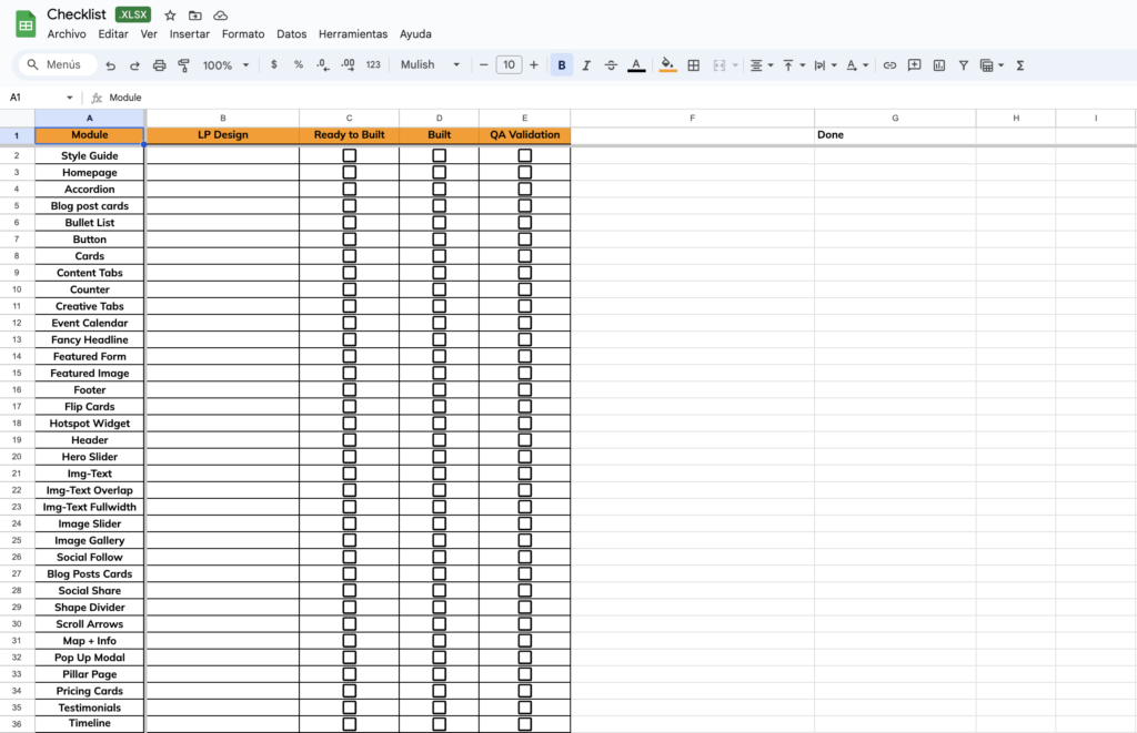
A curiosity: as a pair of designers, we had already started working on a sketch of a Design System, but as we didn’t know the whole process, the project ended up unfinished. However, this experience was a valuable learning experience. We learned that all teams need to be involved and that it’s necessary to review certain stages beforehand, such as the Component Inventory.
➡️ Take a look at the Design System “sketch” de Design System we had created.
03/ Development of the Design System
3.1 Style guide
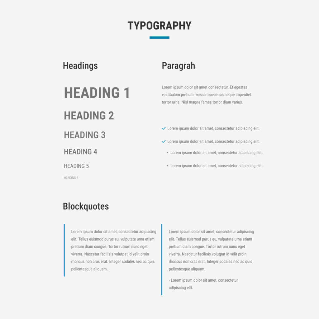
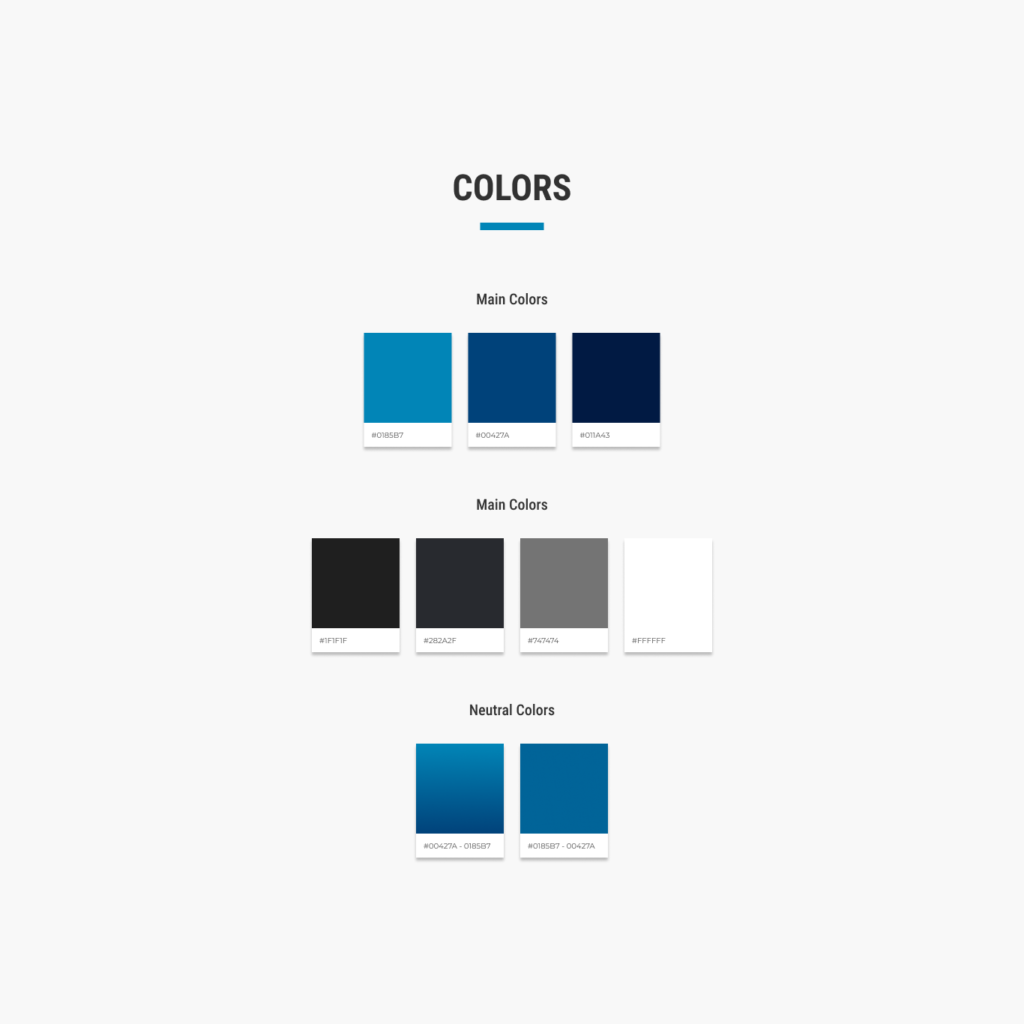
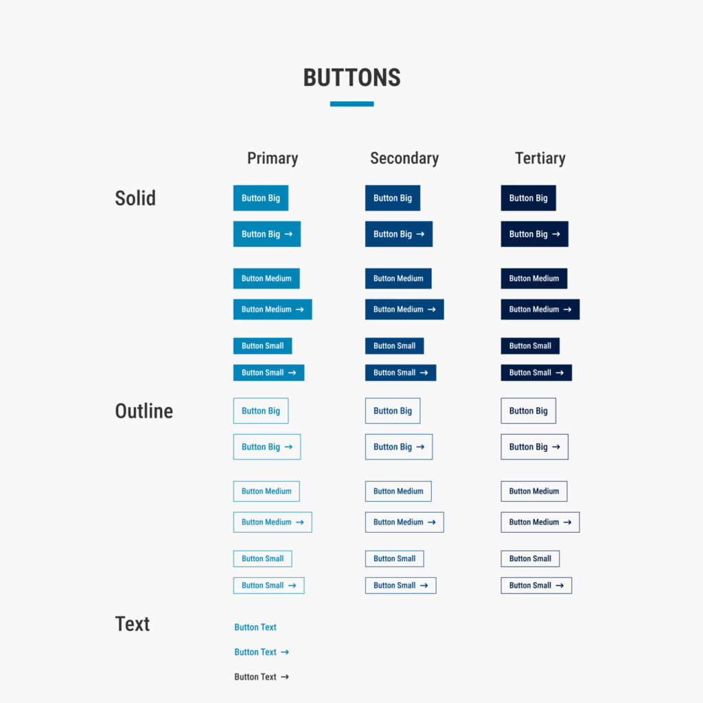
With the values of the Design System and the checklist of components, it was time to create the inventory of visual and interactive components. Basically, it was time to define the visual styles or patterns that would be replicated throughout the design system. This stage involves the detailed cataloging of the main elements, such as buttons, icons, typography, color palettes and interaction patterns.
After the style guide was approved in Design, it was time to replicate it in Front End. Therefore, the design team handed over the project to the development team, which implemented the basic system to ensure consistency and continuous evolution of the components.
3.2 Atomic Design
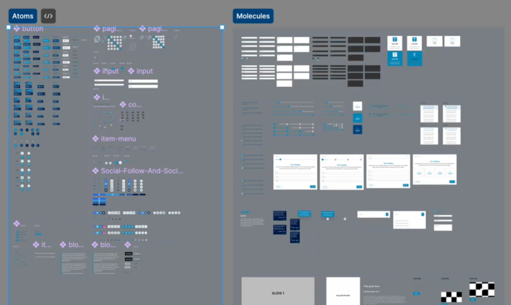
The Design System was based on the concept of Atomic Design, which involves building interfaces from the smallest elements to the most complex.
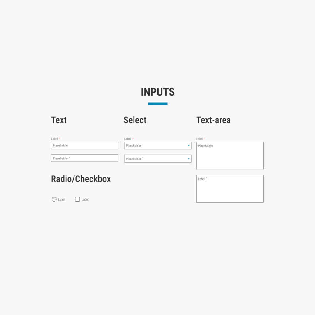
➡️ We start by defining atoms: basic elements such as form labels, text fields or buttons.
➡️ From these atoms, we form molecules: simple combinations of atoms, like a user card made up of a profile picture, a label and a button.
➡️ Next, we unify the molecules to create organisms: more complex components such as headers, product cards and navigation sections.
➡️ Finally, from the organisms, we build the layouts: design structures without specific content, demonstrating the underlying structure of the content.
This hierarchical system guarantees consistency, reuse of components and ease of maintenance of the Design System.
3.3 The Mentoring Process and Gamification
A design system is hard work and a team effort. To support us in this mission, we hired and trained new designers. That’s how the design team grew from a duo. We created a mentoring program to accelerate learning about the agency’s internal processes and the main tools (Figma and HubSpot). At the end of each mentorship, we were able to divide the tasks for creating each component of the design system among the new designers.
The gamification process consists of three main stages:
1️⃣ Defining objectives and users: understanding the game’s objectives and player behavior.
2️⃣ Defining game mechanics: understanding how players interact, creating elements such as rules and rewards.
3️⃣ Implementation and monitoring:to guarantee or optimize the rules in order to achieve the objectives.
➡️ 1️⃣ How users behave:
The hiring process followed a structured pattern: HR defined the profile of the candidates and carried out a psychological analysis after the vacancy had been advertised. Then the lead designer and mentor evaluated the CVs and portfolios and conducted a technical test. The final decision was based on these stages. For the cycle of interviews, hiring and mentoring to work properly, it was important to maintain a balance between HR and the designers.
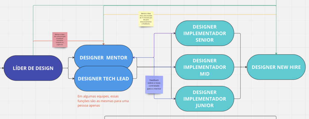
The Mentor Designer was responsible for creating the mentoring for the mentee, with clear objectives and a focus on engagement. With many years of experience in the company, the mentor knew the processes well and could teach them easily. He maintained harmony in the process, adapting to the different profiles of the mentees, which required flexibility. The mentor also had the power to decide, at the end of the sixth week of mentoring, whether the mentee should remain in the team or not.
The mentor offered guidance, but it was up to the mentee to decide how to use it, taking responsibility for facing and resolving the challenges. The mentee, who experiences the greatest level of tension, sets the pace of the mentoring, moving forward, pausing or moving backwards according to their progress in the tasks. Success would depend on their ability to learn and apply, with the reward of graduating at the end of the third month, or not.
➡️ 2️⃣ How users interact
➡️ 3️⃣ Implementation and monitoring
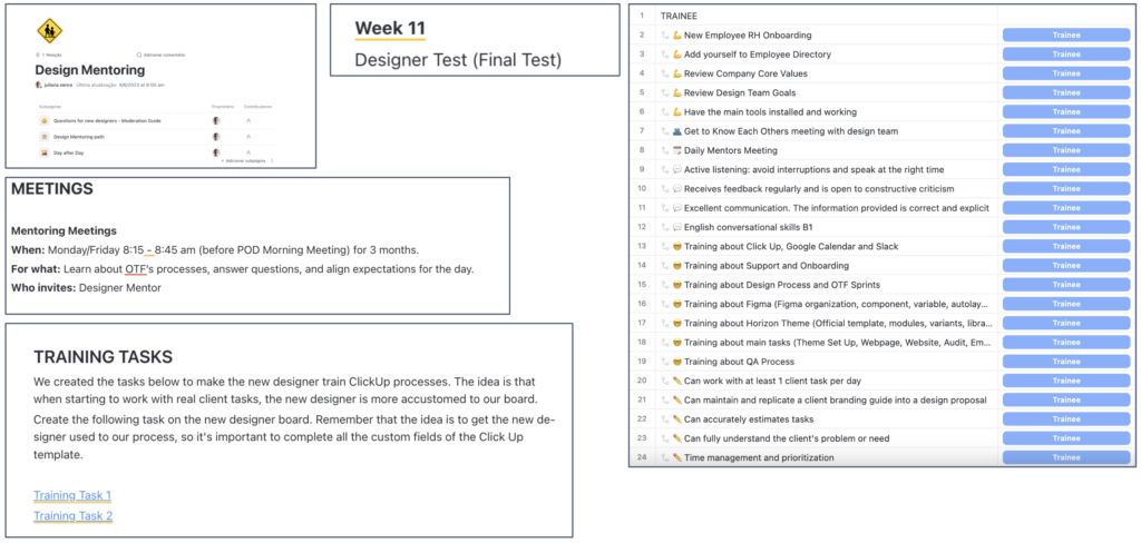
↪ Mandatory daily sessions between mentor and mentee, teaching processes, tools and tasks.
↪ Meetings at the end of the day for questions or feedback, not mandatory.
↪ Every week, the mentee received an email with a study plan.
↪ Before real tasks, the mentee completed 2 tests.
↪ They had to complete 3 courses at HubSpot and pass a final exam to be hired.
↪ A checklist with gradual challenges unlocked soft and hard skills.
↪ The program lasted 3 months, with final feedback on the sixth week.
↪ Mentors met monthly to review the strategy.
The implementation of this process accelerated the growth of the teams, expanding the design team to up to 8 members, all highly specialized in the company’s processes, Figma and the HubSpot platform.
3.4 The Team
A total of 8 designers went through the mentoring process, not all of whom were graduates. The design team, which used to be a duo, now has a total of
➡️ 1 Designer Lead
➡️ 1 Designer Ops and Mentor
➡️ 1 Senior Designer
➡️ 3 Full Designers
➡️ 2 Juniors Designers
Where:
➡️ Designer Lead: Led the team in the creation and evolution of the design system, defining the strategy and aligning the work with the business goals.
➡️ Designer Ops and Mentor: Managed the scalability of the team and the design system, focusing on processes, documentation and promoting the adoption of the system in the company.
➡️ Senior Designer: Acted on complex decisions and reviewed the work of the full and junior designers.
➡️ Full and Junior Designers: Supported the construction of components, made adjustments under supervision, improved their skills and identified improvements to the system.
My role here was multiple: Senior Designer (2020, 2021 and 2022), when we presented the idea, planned and implemented; Mentor, when we started to grow the team (2022, 2023, 2024); Designer Ops (2022, 2023, 2024) when we scaled the DS into template formats, educated the teams and focused on business improvements and innovations.
3.5 Components
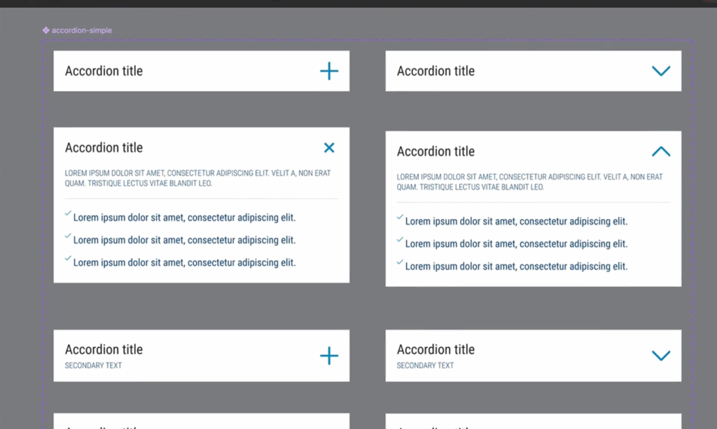
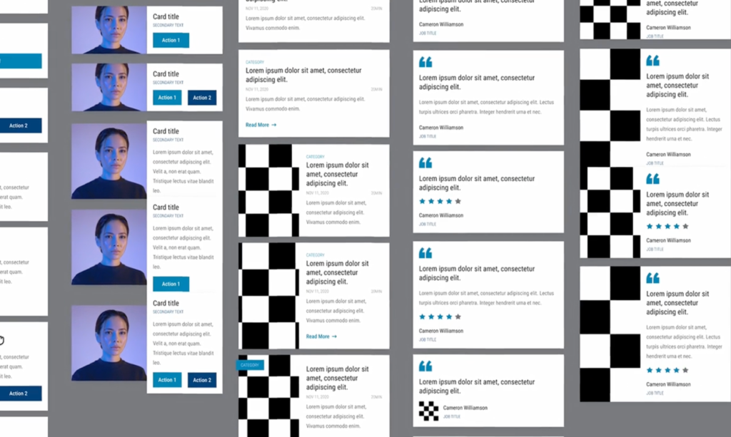
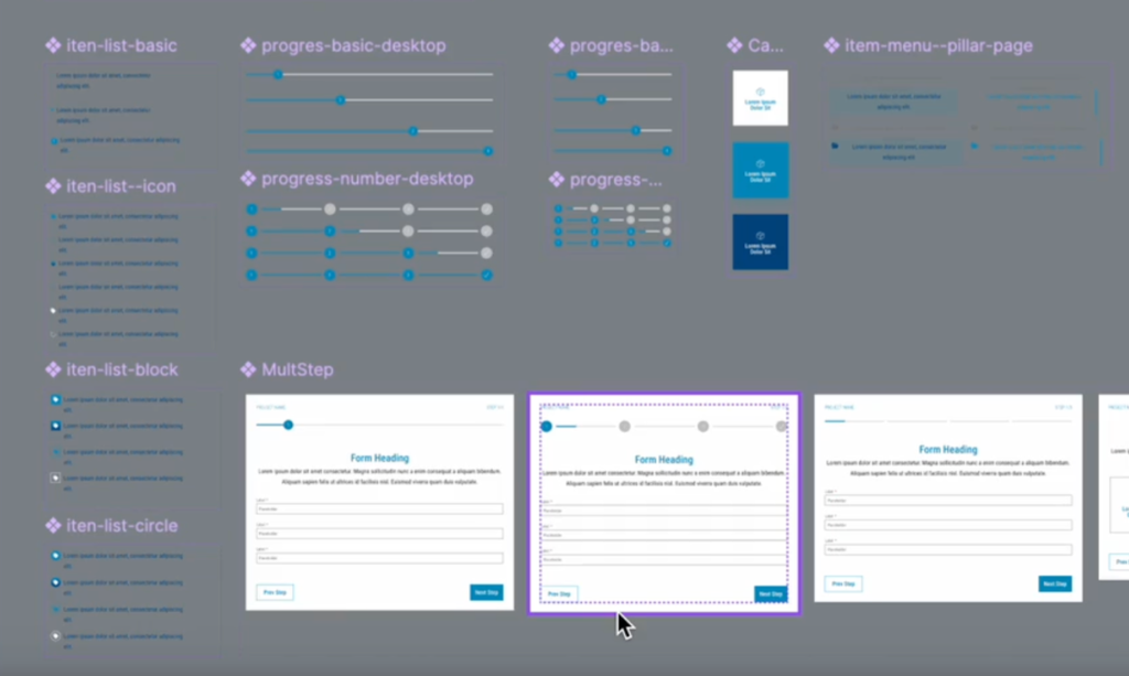
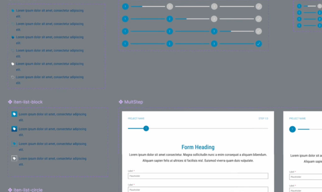
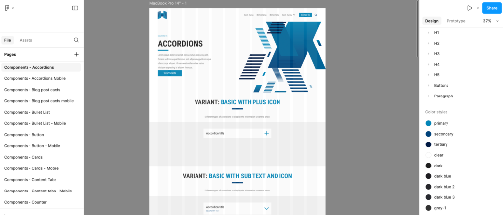
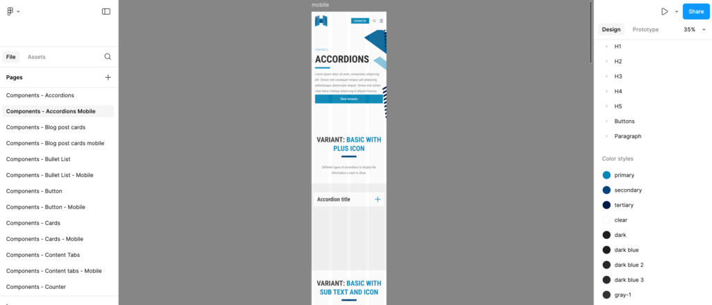
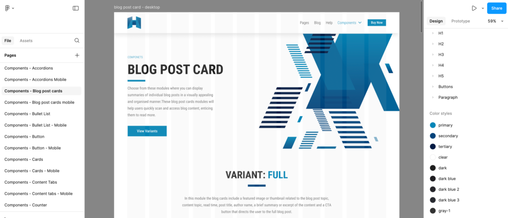
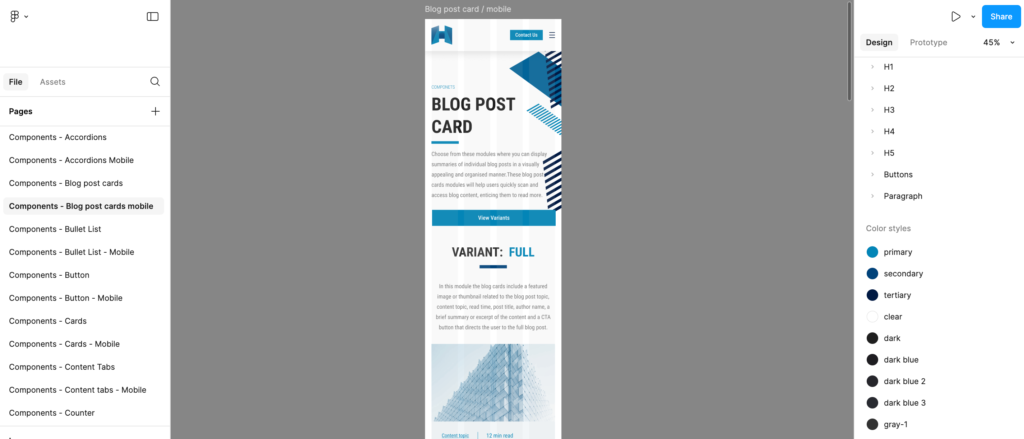
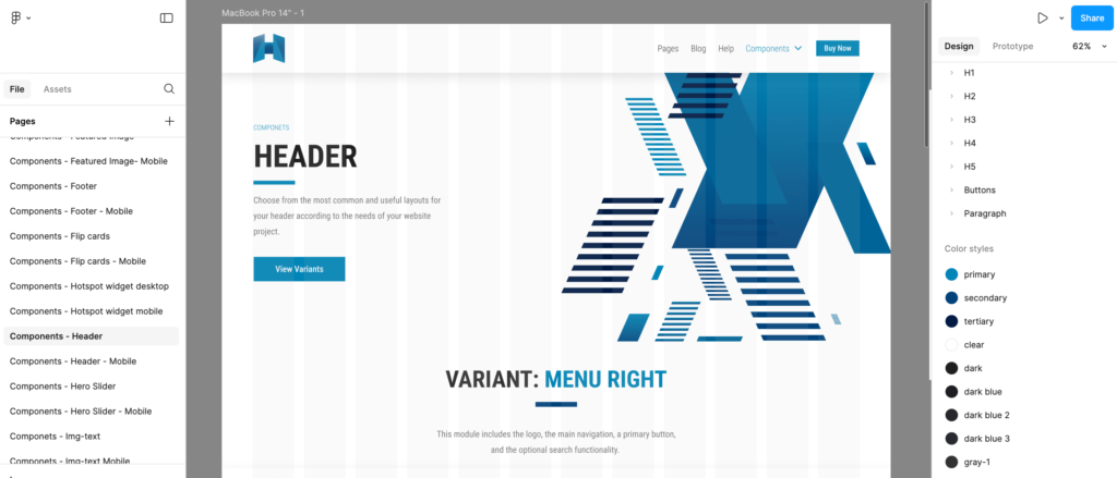
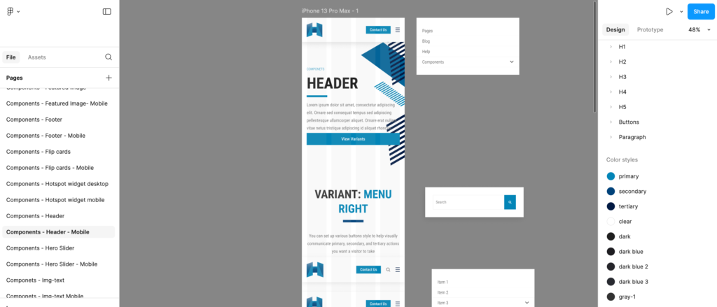
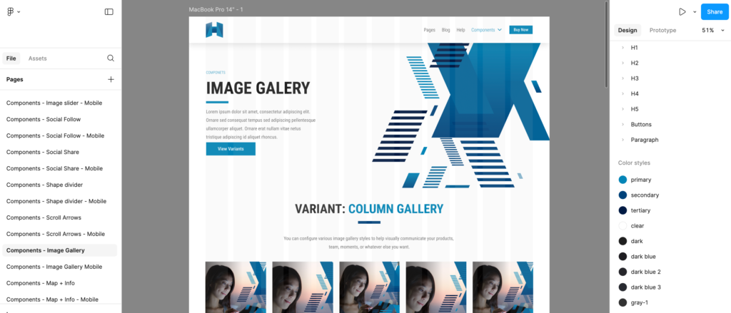
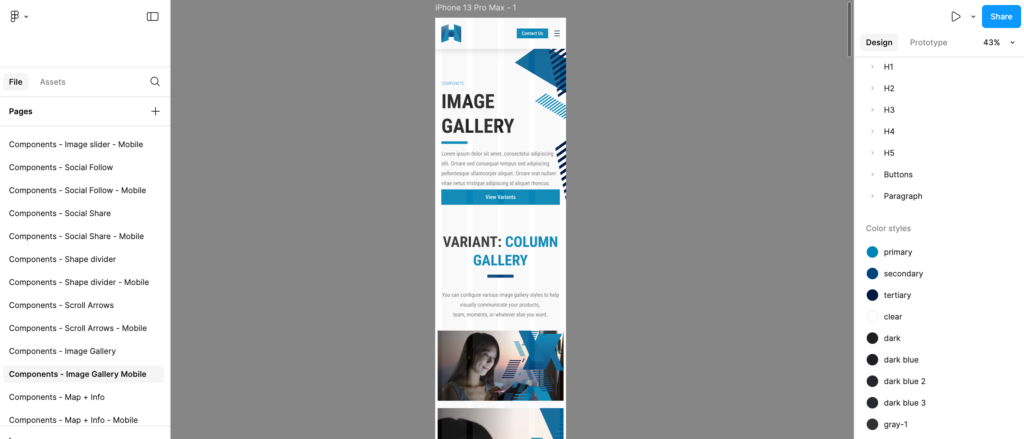
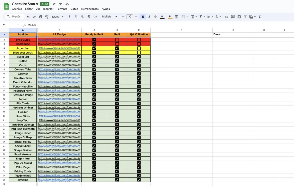
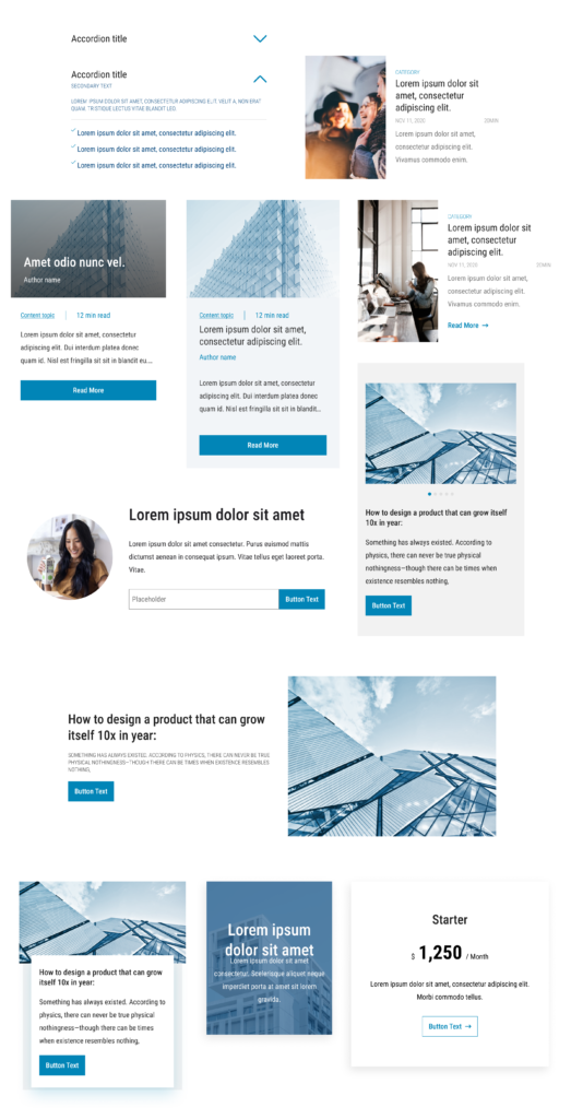
35 components were created and at least 175 variations, desktop and mobile versions, presented on a page for each component.
3.6 Documentation for Internal Use
Two types of documentation were created. The first was a guide showing how to use Figma components in each project, containing guidelines and best practices to ensure correct application in different contexts. The second was a detailed repository of each component and its variations. The documentation was updated after each final QA approval of the components under development. This process precisely defined the structures and standards of the elements.
3.7 HandOff
In addition to implementing the design system, we also established a HandOff process that had to be strictly followed by the design team. The HandOff consisted of handing over the Figma file to the Front-End team, organized as follows:
Thumb: Cover page to display the name, client logo, and project type (Website, Landing pages, Blog, Pillar Page, Emails, Custom Modules, etc.)
__To Dev: The section where developers can find the complete style guide, along with the images, icons, components, and specifications used in the project.
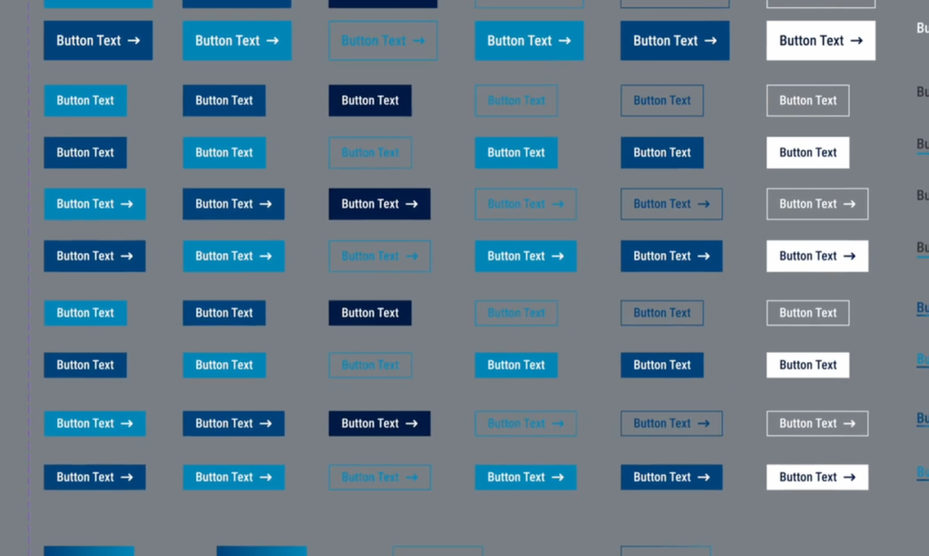
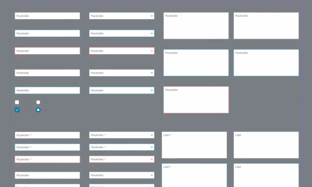
🖍️ Style Guide: Style guide with Logo, Typography (Desktop and Mobile), Colors (Primary, Secondary, Tertiary, Text Colors, Alert Colors, Complementary Colors, Opacity, Gradients, Grayscale), Shadows, Blur, Spacing, Maximum Content, Buttons (Primary, Secondary, Tertiary, in Small, Regular, and Large versions), Forms (Text, Select, Message Text Area, Radio, and Check), in their Default, Focus, and Error versions.
📥 Resources: All the icons, images, and backgrounds used in the prototype.
🧬 Components: All components and their variants, organized by Atoms, Molecules, Organisms, and Layouts.
📐 Specs: An anatomy of the components in more detail, showing especially the spaces in different resolutions.
__Design: Approved designs for the entire project (Homepage, About Us, Landing Pages, Blogs, etc.)
__Not Approved: Designs not approved by the client, for later consultation if needed.
This same file would be thoroughly reviewed by the QA team, serving as the main criterion for project approval in development. Therefore, designers had to ensure that all details in the Figma file were correct, as it functioned as the definitive guide for final approval and delivery to the client.
Project Managers also needed to be aware of this new structure, as it was necessary to inform clients that, from then on, the design team would need to create a detailed Style Guide before starting the main prototype. This process added a new step at the beginning of projects, ensuring consistency in the delivery.
3.8 Team training
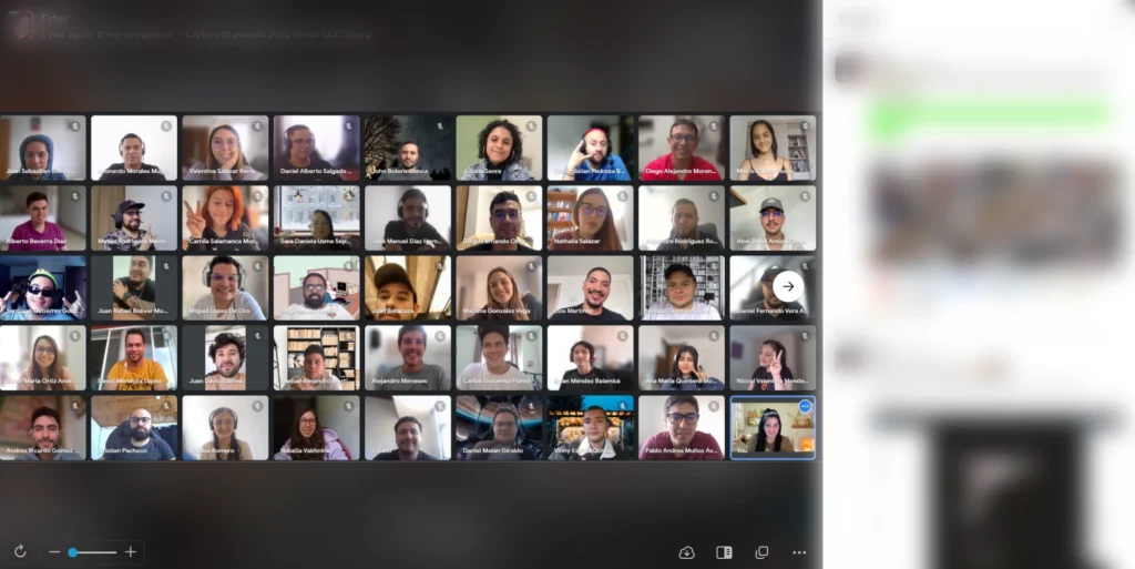
The training was perhaps the most enjoyable part. We were all very excited to have completed an arduous task that had lasted so long. The team felt consolidated, united, and strong. The training really served as the stamp that we had completed a major stage, not only for the company but also for our careers.
We were able to grow the company, expand the team, and consolidate a process, all while staying true to the company’s values. It was a sense of pride shared by everyone, right there on that Zoom screen.
The goal of the training was to ensure the correct and efficient use of the new system, both Handoff and the design system. The team was introduced to the principles of the components, how to apply them to different projects, and how to deliver a project between design and front-end. This training was attended by the Design, Front-End Development, and QA teams.
Reference materials and detailed user guides were provided for ongoing reference. The first feedback was collected, and we felt that the teams were excited and confident about finally having a standardized process.
3.9 Gradual implementation in templates
The vast library of components has allowed us to create more than 20 official templates, including landing pages, blogs, pillar pages, complete websites, and other products. This has made the teams’ day-to-day work even easier. These templates could either be selected by the client to be worked on as they were presented or adapted according to the needs of the project.
04/ Metrics
📈 Team growth was the first measurable metric. The expansion of the design and development teams provided the resources needed to serve new clients and fully adopt the new systems: the design system and the Handoff process.
📈 At the same time, we monitored the expansion of the client portfolio and assessed satisfaction with deliveries, which became more consistent and improved.
📈 The implementation of the new systems was monitored through a careful monthly review, conducted project by project. Whenever processes were not correctly applied, a “Not Quality” tag was added to the project, and those responsible were notified.
📈 The hours spent on each task were meticulously recorded, allowing us to evaluate whether the design system was truly optimizing production time.
📈 The number of tasks completed per week has increased, and in less time, as a direct result of the new system, which has streamlined workflows and improved communication between teams.
📈 With greater efficiency in deliveries, the teams were able to focus on innovations, which now also served as a criterion for earning the monthly bonus.
05/ Evolution and Maintenance
A design system is a living organism, continually revised and updated according to its use and the feedback it receives, both external (clients and users) and internal (team).
An internal space was created to report both bugs and improvements, to adjust and refine existing components, ensuring their relevance and efficiency. Based on these reports, tasks are created and distributed. The DS is constantly updated to meet emerging demands; new components, variables and templates are created or adjusted constantly by the teams.
